Analytics Dashboard
A View Dashboard button on the Time Log Summary opens the Analytics Dashboard — a visual breakdown of the data currently shown in the summary. It uses the same date range and user filters, so you can drill from any summary view into charts and aggregate tables without re-entering filters.
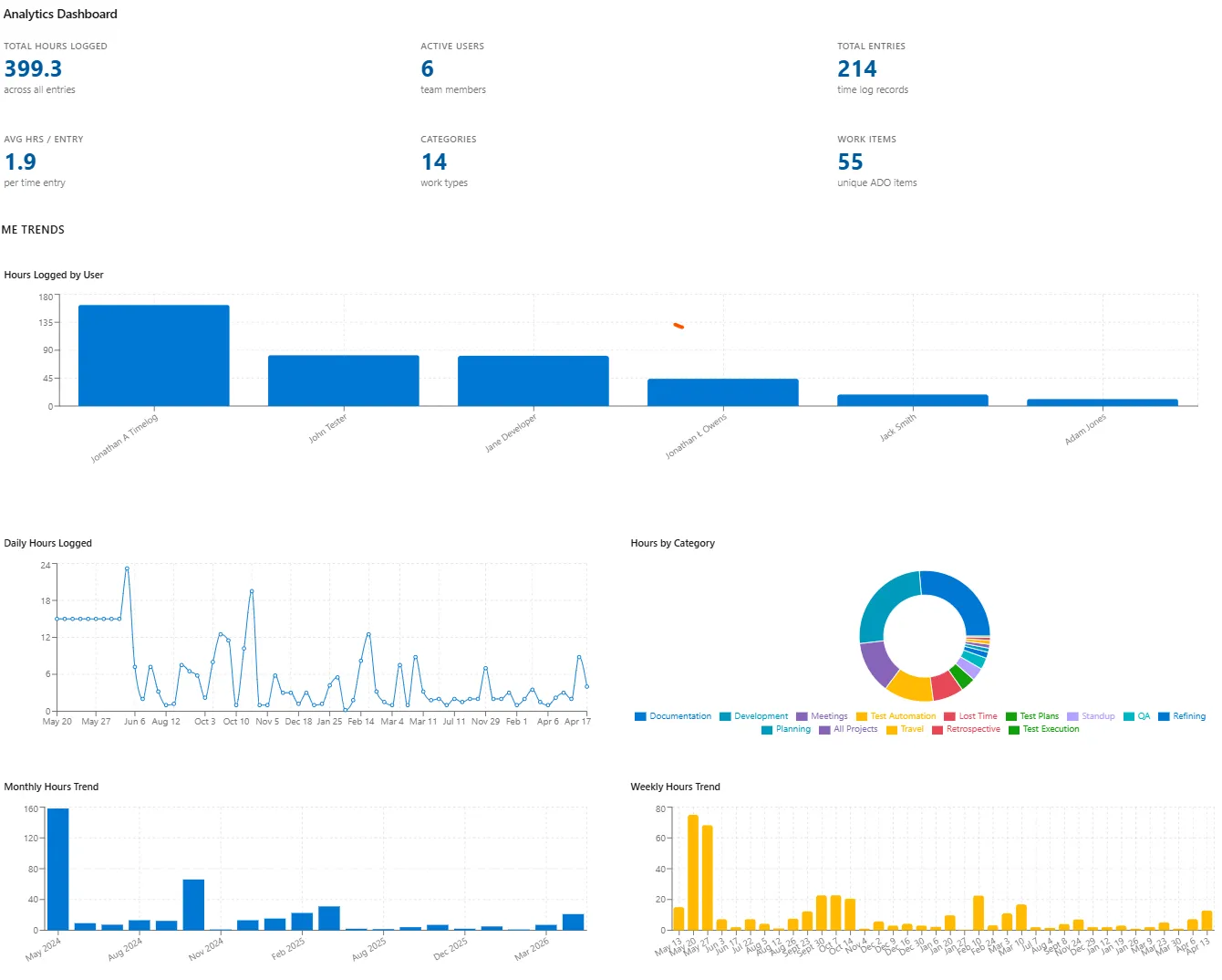
The dashboard shows:
- Summary cards — total hours, active users, total entries, average hours per entry, distinct categories, and distinct work items.
- Time Trends — hours logged by user, daily and weekly trends, monthly totals, and hours split by category.
- User Breakdown — active users per month and average hours per task for the top 10 users.
- Detailed tables — per-user and per-category summaries with entry counts and share of total time.